One system for every screen.
The tokens, components and patterns behind the designer, the admin console and the chat. Every specimen on this page is the real component from the product library, running in your browser, and every value is read from the live tokens.
Blue, ink and four statuses.
Colour means something, or it stays neutral.
Neutrals are tinted blue, never pure grey. Each status has a vivid solid for dots and fills, an ink for text on its tint, a tint and a line. Kind colours mark ontology kinds on their tiles.
Blue
--v50#EEF3FFSelected rows, tints--v100#DCE7FFOn dark text--v200#B7CDFFTonal shadow--v300#86ACFAPrimary shadow--v400#4A8AF6Hover highlight--v500#1F74F2Gradient top--v600#0D6EF2Primary, links--v700#0A58C8Hover, text on tint--v800#0B2FC2Top bar--v900#071A5EDeep navy
Neutral
--n0#FFFFFFSurfaces--n25#FAFBFERaised tint--n50#F4F6FBApp background--n75#F0F3F9Row hover--n100#E9EDF6Hairline fills--n200#D9DFECBorders--n300#BFC8DAStrong borders--n400#8E9AB3Decoration only--n500#647089Muted text--n600#4A5468Secondary text--n700#333B4CStrong secondary--n800#1F2637Headings on tint--n900#121829Body text
Status
| Solid | Ink | Tint | Line | |
|---|---|---|---|---|
| Ok | --ok-solid#10A567 | --ok#0A6B45 | --ok-bg#E3F9EF | --ok-line#9BDDBC |
| Warning | --warn-solid#F5A524 | --warn#8A5300 | --warn-bg#FFF4DC | --warn-line#F3CF86 |
| Danger | --bad-solid#D92D3A | --bad#A81E2B | --bad-bg#FFE9EA | --bad-line#F2AAB0 |
| Info | --info-solid#0EA5E9 | --info#0369A1 | --info-bg#E6F4FB | --info-line#B3C6FF |
Kinds
--k-object#0D6EF2Object--k-interface#6B4BE8Interface--k-link#333B4CLink--k-action#EA580CAction--k-value#0D9488Value type--k-event#E53F89Event--k-function#B45309Function--k-security#16A34ASecurity--k-source#8A7F72Source
Frame and brand
--frame-bar#0B2FC2Top bar--frame-nav#0A1E5CNavigation--nav-current#FF5FA2Current item--frame-tile#FFC21ANew chat, logo tile--brand-offset#E53F89Logo pink, Event--brand-offset-strong#C22A6EAvatar tile
Four faces, one job each.
Figtree does the reading.
Bricolage Grotesque for page titles and display, Figtree for everything people read and click, DM Serif Display for metrics, and JetBrains Mono for code, type pills and keys only.
- DisplayBricolage 60 / 600
.t-display - Contracts
- Page titleBricolage 34 / 600
.t-h1 - Procurement domain
- SectionFigtree 21 / 600
.t-h2 - Properties and links
- Card titleFigtree 16 / 600
.t-h3 - Contract C-1042
- BodyFigtree 14 / 400
.t-body - Every answer cites the source it came from.
- SmallFigtree 13 / 400
.t-sm - Updated 4 minutes ago by Mira Jansen
- LabelFigtree 11 / 600, capitals
.t-label - In use
- OverlineFigtree 12 / 600, binding gradient
.t-over - Governed knowledge
- MetricDM Serif Display 44
.t-stat - 1,284
- CodeJetBrains Mono 12.5
.codefont - kind: ObjectType
Size tokens
--fs-1111px--fs-1212px--fs-1313px--fs-1414px--fs-1515px--fs-1616px--fs-1717px--fs-2020px--fs-2121px--fs-2424px--fs-3434px--fs-4444px--fs-6060px
Eight steps of space.
Fixed heights, so nothing moves.
Spacing runs from 4 to 64. Controls, rows and cards have fixed heights, and their skeletons keep them, so a screen does not shift when its data lands.
Space
--space-14px--space-28px--space-312px--space-416px--space-524px--space-632px--space-748px--space-864px
Controls
- Small button
--h-btn-sm32px - Button
--h-btn38px - Page action
--h-btn-lg46px - Input
--h-input40px - Small input
--h-input-sm32px - Touch target
--h-touch44px
Labels
- Badge
--h-badge24px - Chip
--h-chip30px - Tag
--h-tag22px - Key
--h-kbd20px - Count
--h-count18px
Lists
- Row
--h-row56px - Dense row
--h-row-dense44px - Navigation row
--h-nav36px - Tree row
--h-tree34px - Menu row
--h-menu36px - Tab bar
--h-tab48px - Graph pill
--h-pill36px
Layout
- Stat card
--h-card-stat148px - Top bar
--h-topbar64px - Sidebar
--w-side264px - Rail
--w-rail72px
Square controls, soft depth.
Only avatars and meters are round.
Buttons are square with a hard 3 px shadow in a tint of their own colour. Controls, badges and chips are 0 to 2 px, cards 8 at most. Depth comes from wide, soft, layered shadows, never from darkness.
Radius
--r-none0Buttons--r-xs2pxChips, badges--r-md4pxInputs, menus--r-lg6pxPopovers--r-xl8pxCards, dialogs--r-full999pxAvatars, meters
Elevation
--e1Cards at rest--e2Popovers, menus--e3Floating panels--e-dialogDialogs--e-sheetRight sheet
Focus
--ringA 4 px halo plus a 1 px line--ring-insetInside full-bleed regions
Quick, then out of the way.
Reduced motion turns it off.
A press answers in 80 ms, a hover in 120, a panel in 200 and a layout change in 320. Exits are quicker than entrances. Under reduced motion every duration is zero and the shimmer stops.
- Press
--dur-press0s - Hover
--dur-hover0s - Exit
--dur-exit0s - Panel
--dur-panel0s - Layout
--dur-layout0s - Skeleton shimmer
--dur-shimmer1.6s
Easing
- Hover and press
--ease-outease-out - Panels entering
--ease-decelcubic-bezier(0,0,.2,1) - Layout
--ease-in-outease-in-out
Six layers, in order.
Nothing invents its own z-index.
The canvas sits at the bottom, then graph nodes, toolbars, drawers, popovers and modals. A component takes its layer from the Layer context, never from a number of its own.
- 50Dialogs and modal sheets
--z-modal - 40Menus, tooltips, popovers
--z-popover - 30Side drawers
--z-drawer - 20Canvas toolbars
--z-toolbar - 10Graph nodes
--z-node - 0The canvas
--z-canvas
One stroke, one grid.
Every kind has its tile.
Icons are 1.6 px strokes in the current text colour on a 16 px grid, at 13, 20 or 22 in their slots. An object type is the isometric cube everywhere, an interface its hollow hexagon on a dashed tile, a domain the stacked layers.
Kind tiles
- object
- interface
- domain
- link
- action
- value
- event
- function
- security
- source
- folder
Glyphs
- alert
- api
- apps
- arrow-down
- arrow-left
- arrow-right
- attach
- audience
- audit
- auto-layout
- bell
- bell-off
- branch
- browser
- chat
- check
- chevron-down
- chevron-left
- chevron-right
- chevron-up
- chevrons-up-down
- copy
- database
- department
- deploy
- designer
- desktop
- download
- explain
- eye
- eye-off
- file
- file-code
- filter
- fit
- flag
- health
- history
- home
- identity
- inbox
- info
- kind-action
- kind-domain
- kind-event
- kind-folder
- kind-function
- kind-interface
- kind-link
- kind-object
- kind-security
- kind-source
- kind-value
- link
- lock
- maximize
- mcp
- menu
- merge
- minimize
- minus
- more
- package
- pin
- plus
- search
- segments
- send
- service
- settings
- shield
- sort
- spinner
- swarm
- team
- trash
- undo
- user
- users
- x
- x-circle
- zoom-in
One Dark, lifted for contrast.
Keys red, strings green, references blue.
GOL and diffs use the One Dark palette, each hue lifted one step so it keeps 4.5:1 at 12.5 px on the diff tints. A changed token gets a stronger box on top of its line tint.
--code-bg#282C34Surface--code-text#B9C0CCText--code-key#F39AA1Keys--code-string#A5CF86Strings--code-ref#8AC8F7References--code-scalar#DD9FECScalars--code-comment#ADB4BFComments
kind: ObjectTypename: Contractdomain: procurementowner: "procurement-team"owner: "legal-team"properties: value: { type: Money }# reviewed by legal on 2026-09-22Labels stay, errors explain.
Every input is 40 px.
A field is a label, its control and a hint that an error replaces and announces. Required fields carry a native required and a hidden word; placeholders never stand in for labels.
Small parts, plastic feel.
Chips choose, badges state, tags type.
Chips are filters and choices you can toggle or remove. Badges state a status in a word. Tags name a GOL type. Counts are numbers that need attention; keys show shortcuts.
Chips
Badges
Tags, counts, dots and keys
Avatars
Say what happened.
Then say what to do.
Callouts carry a status and at most two links. Toasts report a result and leave after 4 seconds; with Undo they stay for 10. Blockers are never toasts: they are alert dialogs.
Dense tables, honest counts.
Masked is not missing.
Rows are 56 px, or 44 when dense, and numbers are right aligned in tabular figures. A masked cell shows the mask the policy returns, and a list says how many rows it withheld.
| Contract | Supplier | Owner | Value | Status | |
|---|---|---|---|---|---|
| C-1042 | Northwind Metals | MJMira Jansen | € 184,000 | active | |
| C-1043 | Contoso Freight | OHOmar Haddad | € 62,500 | draft | |
| C-1051 | Fabrikam Energy | LVLotte de Vries | € ••••• | active |
Shape
- Properties
- 14
- Links
- 6
- Actions
- 3
In use
- Objects
- 1,284
- Sources
- 2
- Dependents
- 9
One dialog, one sheet,
one confirm.
Open them. The footer reads: a note on what the action writes, Cancel, then the verb. A confirm names the thing and its blast radius, in red only when something is removed.
Ten states,
every component.
A component is not done until each of these renders and is tested: default, hover, pressed, focus, selected, disabled, loading, empty, error and withheld.
- DefaultAt rest, the face and its ledge
- HoverLifts 1 px; point at it
- PressedSinks 3 px, the shadow goes inside; press it
- FocusThe ring, from the keyboard only; tab to it
- SelectedBlue tint and ink; never a heavy fill
- Active
- DisabledMuted, no shadow, no pointer
- LoadingThe same size with a shimmer bar
- EmptyOne of six families, with an action
- Nothing matches
- ErrorSays what is wrong and how to fix it
- Start with a capital letter: Contract
- WithheldA count and a reason class, never the data
Six kinds of nothing.
Withheld is never empty.
Every empty area says which of six things is true, with one blue-ink drawing each: large at 160 px, medium at 96, inline without a drawing.

Start here
Add your first type to this domain.
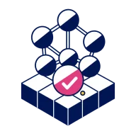
All clear
No problems in version 1.4.0.

Nothing matches
Try fewer filters. Withheld rows may exist.
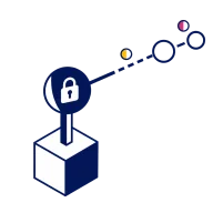
Withheld from you
The legal marking hides these contracts.
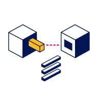
Not connected
SharePoint could not be reached.
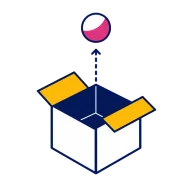
Not shipped yet
Scorecards arrive in a later release.
Skeletons keep the shape.
No spinners in content.
A screen renders its skeleton from the same component with a loading prop, at the exact size. Headers, tabs and filters show real text at once; only data becomes bars. After 8 seconds a quiet line offers Retry, and an error shows the matching empty state.
Shapes
bar 12bar 14bar 30square 18square 28circle 8circle 30
Loaded and loading, the same size
| Contract | Owner | Status |
|---|
When it fails: the matching family
Contracts could not load
The server did not answer. Nothing was changed.
Say withheld, offer access.
Never leak what is hidden.
When a policy hides rows or fields, Gluon says how many and why in general terms, and always offers Request access. Counts only: withheld rows are never fetched.
Four widths, one footer order.
Anything bigger is a page.
Compact 480 for small forms, alert 560, large 800, the wizard 1000 by 640, and the right sheet at 460 everywhere, lineage included. The footer always reads note, Cancel, verb.
- Compact dialog
--dialog-compact480px - Alert
--dialog-alert560px - Large dialog
--dialog-large800px - Wizard
--dialog-wizard-w1000px - Right sheet
--sheet-w460px
Electric bar, navy navigation.
Pink marks where you are.
The top bar is electric blue with one search box. The navigation is navy with 36 px rows and no selection fill: the current item turns pink, an open parent turns bold white with its chevron up, and red counts ask for attention.
 gluon
Every pair checked.
AA, or it does not ship.
These ratios are computed in your browser from the live tokens. Body text needs 4.5:1; large text (24 px, or 19 px bold) needs 3:1. A pair below both is decoration only.
| Text | On | Used for | Ratio | Result |
|---|---|---|---|---|
--n900 | --n0#FFFFFF | Body text | 17.67:1 | AA |
--n600 | --n0#FFFFFF | Secondary text | 7.61:1 | AA |
--n500 | --n0#FFFFFF | Muted text, placeholders | 4.98:1 | AA |
--n500 | --n50#F4F6FB | Muted text on the app background | 4.60:1 | AA |
--n400 | --n0#FFFFFF | Dividers and icons only | 2.83:1 | Fails |
--v600 | --n0#FFFFFF | Links | 4.64:1 | AA |
--v700 | --v50#EEF3FF | Selected rows | 5.83:1 | AA |
--n0 | --v600#0D6EF2 | Primary button | 4.64:1 | AA |
--n0 | --bad-solid#D92D3A | Danger button | 4.79:1 | AA |
--ok | --ok-bg#E3F9EF | Ok on its tint | 5.95:1 | AA |
--warn | --warn-bg#FFF4DC | Warning on its tint | 5.79:1 | AA |
--bad | --bad-bg#FFE9EA | Danger on its tint | 6.27:1 | AA |
--info | --info-bg#E6F4FB | Info on its tint | 5.28:1 | AA |
--n0 | --frame-nav#0A1E5C | Navigation text | 15.52:1 | AA |
--nav-current | --frame-nav#0A1E5C | Current navigation item | 5.48:1 | AA |
--n900 | --frame-tile#FFC21A | New chat | 10.93:1 | AA |
--n0 | --brand-offset-strong#C22A6E | Avatar initials | 5.45:1 | AA |
--n0 | --brand-offset#E53F89 | Logo pink: never text | 3.89:1 | AA large |
Domain, Object, Link, Action.
The words people see.
The interface speaks the product's words. Terms from domain-driven design stay in GOL and in the advanced panel, never in labels, menus or answers.
Say, not
| Say | Not |
|---|---|
| Domain | Bounded context |
| Object | Aggregate, entity |
| Link | Relation, association |
| Action | Command |
| Withheld | Empty, no results |
| Request access | Contact your administrator |
Copy rules
- No em dashes, in the interface or in documents.
- A confirm asks about the named thing. Buttons are verbs. Never “Are you sure?”, never Yes or No.
- Blockers are alert dialogs. Toasts only report results.
- Headers, tabs and filters show real text while data loads.
- A number comes with its source, and a refusal names its policy.