One site, built from few parts.
The parts glu0n.com is made of, written from its homepage: the header and the menus, the sections, the lists and cards, the images, the footer and how things move. Every page is built from these, and nothing else.
Gluon blue,
one yellow button.
The blue is the header, the open menus and the row in hand. The yellow is the one main action. Text is ink and grey on white and light grey; the footer is navy.
Grounds
- Gluon blue#0D6EF2 · Header, menus, row in hand
- Navy#071A5E · Footer, label boxes
- White#FFFFFF · Sections, cards
- Light grey#F4F6FB · Every other section
Ink and accents
- Ink#121829 · Titles, text
- Grey#647089 · A title's second half
- Yellow#FFC21A · Get started, Subscribe
Three faces,
the same as the collateral.
The site uses the collateral's faces, not the product's: Space Grotesk for titles, Switzer for text and IBM Plex Mono for labels.
One blue bar,
across the full width.
The bar is Gluon blue on every page and dark only over the homepage's opening. An open menu hangs right under it in the same flat blue, and turns the bar blue too. This page wears it.
Do
- Group headings in blue capitals, no line under them.
- Each item: a tile, its name and one line that fits on one line.
- A phase or a document's kind in grey, full only on hover.
Don’t
- No gap, shadow or line between the bar and an open menu.
- No second blue or a gradient in the bar.
- No item whose line runs to two lines beside one that does not.
A label and a title.
Links under the content.
A section opens with a small mono label and a title in two tones: ink, then grey. No sentence or button beside the title; a link to more sits under the content. White and light grey sections take turns.
Six phases.
One decision point.
- /01Action types in the model
- /02Mandate and approvers
- /03Verdict
- /04Decision trail
Do
- One idea per section, in its title.
- The title's second half carries the point.
- A text link with its arrow under the content.
Don’t
- No sentence and buttons in a column beside the title.
- No two buttons where one text link will do.
- No em dashes in the copy.
Hairlines first,
cards when they lead somewhere.
Steps and layers are numbered rows on hairlines. A card is white with square corners and leads to one page. Questions open in place with a plus that turns into a minus.
See it decide on your own sources.
Start with one question that must be right, in your own environment.
How is Gluon different from RAG?
RAG finds passages that look like the question. Gluon first checks which sources have authority, which version applies and whether this person may see it.
What happens if we stop?
Gluon keeps running. Your data, rules and decision trails stay where they are, and the code remains yours.
Four end tiles
See it decide on your own sources.
Start with one question that must be right, in your own environment.
Navy. The default. Beside the questions at the end of the homepage, stars only in its far corner.
See it decide on your own sources.
Start with one question that must be right, in your own environment.
Yellow. The logo tile's yellow with the planet. The loudest of the four: once per page at most.
See it decide on your own sources.
Start with one question that must be right, in your own environment.
Strip. One low row on white for a close that runs the full width and should stay calm.
See it decide on your own sources.
Start with one question that must be right, in your own environment.
Blue. Gluon blue with the planet for a full-width close on a white page, as Pricing ends.
Three kinds of picture.
Nothing drawn for one page.
Gluon's blue-ink drawings, real screens of the product and photos of people at work. A page never gets a drawing, diagram or pattern of its own: when no drawing fits, a real screen does.

Connected knowledge 
Governed access 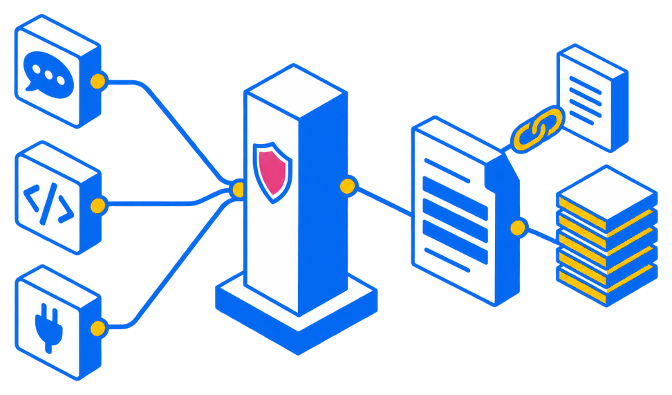
One permission path 
Reviewed publishing 
Deployment boundaries
How this was reached
Gluon picked a way to answer, read what you may see, then a model wrote the answer from what it read.
- Planned
Read the supplier's live contracts, then search the documents.
Toolerp-live/contracts-by-supplierModelGPT-5 (EU) - Read from memorymemory · just now1 result3 ms
- Searched the indexindex · just now2 results
- AnsweredGPT-5 (EU)10 ms
- Checked
- No personal values masked in the answer
- Every figure was found in the evidence
- Left out: tool:erp-live/contracts-by-supplier: 1 row withheld for you (access)
Technical details
- contracts-by-supplier(supplierId: nordic-steel)3 ms
- search(contracts: Nordic Steel)
- answer: GPT-5 (EU) (model:eu-gpt-5-2026-08) · 1,840 tokens
- Total time 193 ms
Do
- Drawings in the locked blue-ink style, no text inside them.
- Real screens of the product as it is.
- Photos of people busy at work, in cool light, licensed for the web.
Don’t
- No isometric plates, slanted cards or dotted dark grounds.
- No stock clichés: robot hands, glowing brains, holograms.
- No photo whose licence forbids it in a public repository.
Easy and smooth.
Still when asked.
Things fade and glide over a fraction of a second, easing in and out. Anything that moves by itself shows its progress, can be paused and holds still under a pointer.
Do
- Crossfade a picture in place instead of moving it.
- A loading bar in the tab of a strip that moves on by itself.
- Nothing moves with reduced motion or the footer's pause.
Don’t
- No jumps: a panel keeps its height while its content changes.
- No motion the reader cannot stop.
- No reveal that hides content from someone who does not scroll.